As mentioned in the last post, the two most important marketing pieces that will gain audience attention for your film are the trailer and the key art, the film’s poster image. This image sets the audience expectation of what they will see before they even look at who is in the film, what it is about, and whether they will pay further attention to its advertising. It is very important to get this piece right.
I spoke with Mark Crawford of Blood and Chocolate, a boutique design firm in Los Angeles specializing in entertainment advertising, to learn how they work with studios and producers to create the visual identity of a film.
SC: Where do you start when coming up with design concepts? Do you watch the film? Is there usually a brief that includes the marketing goals? Do you talk about the sensibilities of the audience the film is trying to reach?
MC: “There is no set way to begin the development of a key art image for a motion picture. It is as fluid as the actual production of the film, and is equally as much a collaborative effort.
On some projects, we are brought on before the film has even begun shooting and we may begin developing conceptual ideas from the script or photo-shoot concepts that can be covered when the production begins. With this approach, important scenes can be extensively covered in the unit photography, assuring we have good images with which to work. But in most cases, the film is in production or completed.
The actual beginning of developing images usually starts with a direction meeting with the studio executive overseeing the project. Having been involved with the producers, film makers and other studio executives since the inception of the project, he or she communicates the positioning and tone that the studio feels is the best way to sell the movie. These would include everything from the actors to be featured on the 1-sheet to the message communicated in the copy line.
Based on the direction, we develop a series of poster images, usually anywhere from 25 to 50, that explore a wide range of imagery and tone that could represent the film.”
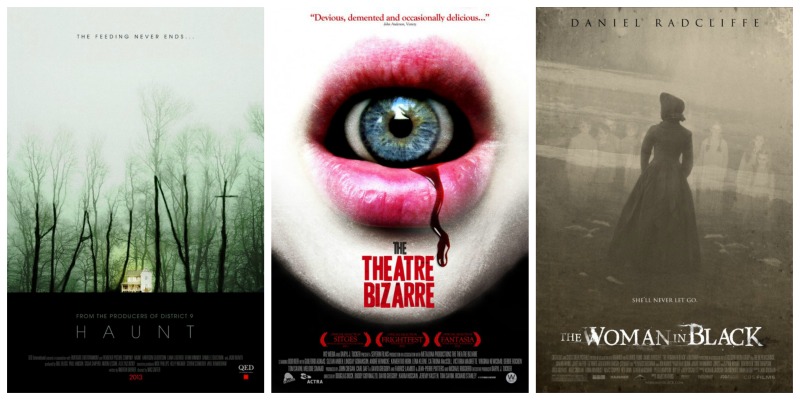
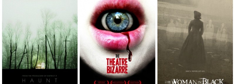
SC: How does Blood and Chocolate keep horror designs fresh? Very often a wall of horror “posters” or thumbnail images starts looking the same when viewed in the iTunes store (dark backgrounds, old houses, a knife and blood).
MC: “Horror is a very widely exploited genre, making the mission to stand out even more of a challenge. The goal is to develop an image that will stop people in their tracks.
The first place to start is the film. There may be scenes within the movie that provide the inspiration we are looking for. What are the unique aspects of this film that I can draw upon to create an image that is specific to to this movie? Or is there an establishing shot that just hints something very intense is about to happen. A very simple image, with a provocative copy line, can let the viewer connect the dots.
Sometimes, there is imagery within the film that can be used as inspiration to create an iconic poster-something not even in the movie but supports the concept.
Ultimately, the technique of the final artwork is crucial.”
SC: Is the real purpose behind the key art to tell the film’s story in a visual way? Or to give an emotional resonance that draws one into investigating further?
MC: “We feel that the purpose of the key art is to pique your interest in a film, not try to tell the entire story. It is the single image that represents the journey that the film maker will take you on.”
SC: Where do you stand on having several different art designs for a film campaign? Should there be the same design for theatrical release, digital release, DVD release so the audience becomes familiar with it? Or is it effective to have variations on that theme to suit the medium that is selling the film?
MC: “There should be one primary image to represent the film- one image that becomes the signature. However, the internet offers an amazing forum to feature secondary images that can broaden out the impression of the film.
Ultimately, it is important to have a focused campaign that can expand out.”
SC: Does the key art usually lead when it comes to other advertising elements like outdoor, web design and even trailers and TV spots?
MC: “Depending upon the budget and the scope of the marketing plan, sometimes teaser posters are created in advance to promote certain aspects of a film.They can feature the characters or be based on the concept of the movie. It can be a provocative way to build awareness. These ultimately lead to the key art which is the image that will represent the movie.”
SC: Is it part of your work to come up with taglines or other text as well or is that a separate entity’s work? How about other technical considerations like credit blocks? What size font, what kind of font, placement on the poster? Is that dictated in a certain way (WGA, PGA, DGA rules?)
MC: “Development of copy directions is part of the first phase 1-sheet presentation. It is very much an integral part of the poster and must work hand-in-hand with the visual. It is not unusual to develop teaser images that are copy alone.
As far as the billing block, those are provided by the studio and represent the legal credits called out by the different guilds. Their size on a poster is dictated by the size of the title.”
SC: Are images used in the design work created on set or does Blood and Chocolate usually arrange their own photo shoot to suit the proposed design?
MC: “Images used in one-sheets come from a variety of places. Often they are from unit photography that is taken during production or special shoots of the talent done later. Often times, Blood & Chocolate will special shoot specific images if they are needed for specific concepts. Photographic stock agencies are another resource.”
SC: When you are hired to create the design, who owns the design? From a standpoint of possibly wanting to sell the artwork as a separate function than purely promotional, does the client have the right to do that without further compensation to you?
MC: “Once the key art image is finished and delivered, it is owned by the studio. They can use it any way they choose to promote the movie.”
SC:Name one design in particular and illustrate how you approached it?
MC: THE BLAIR WITCH PROJECT
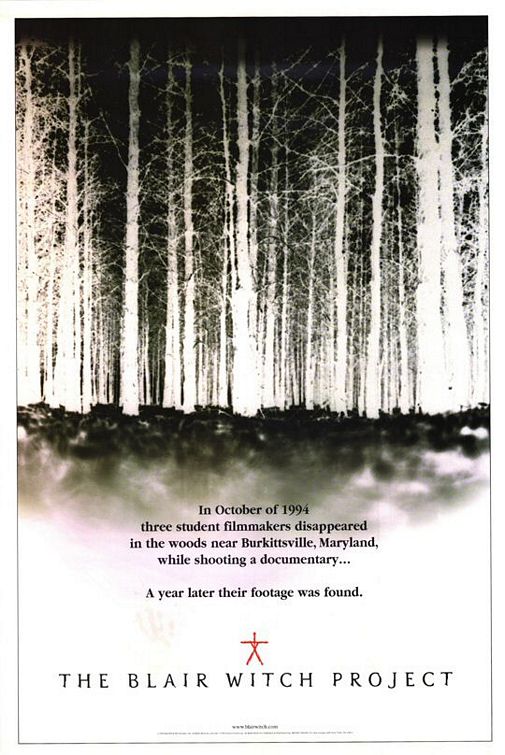
“It was the first of the reality-based modern horror movies. The entire movie is the tension of not knowing exactly where it is going. Ultimately, the haunting feeling is the absence of anything you can actually see, just their fear.
The poster conveys the same feeling. It is a low-angle shot – almost like someone laying on the ground, but we see no one. The only image is the woods, shown as a negative image. The documentary-style copy delivers an ominous message. No words like ‘terror’ or ‘horror,’ nothing cliche. It just says how their footage was found. Open ended and haunting.”
SC: Can you give a ballpark estimate for design cost for key art?
MC: “The cost of key art depends a number of factors. For smaller independent movies, the budget is usually smaller. They require fewer concepts and make fewer changes.For larger movies, the budget is bigger, as is the scope of work to be done to get to a final poster.”
Sheri Candler
Sheri Candler October 31st, 2013
Posted In: Creative, Key Art, Marketing
Tags: Blair Witch Project, Blood and Chocolate Design, entertainment advertising, film key art, film poster, film trailer, independent film, Mark Crawford, one sheet, photo shoot, set photography, stock photography, studios, teaser posters