
Rethinking Your Key Art Game Plan, Part 1
Over the next several weeks, The Film Collaborative’s Creative Director, David Averbach, who has worked with dozens of TFC Clients and other filmmakers to help them create and refine their key art, will talk about ways you can avoid the problem of finding out all too late that you don’t actually have the proper materials to produce the key art you want to make.
Note: This Key Art series is intended for micro-budget filmmakers whose crew is not under a union contract. If your film’s crew is under an IATSE contract, you will need to abide by the rules regarding still photographers on set as forth by the union. We have been advised that there may be penalties involved by bringing an intern or PA in to shoot stills.
See Part II HERE
Takeaway: For narrative feature films, understanding the technical aspects of producing key art and thinking ahead to your key art while on your film set can save time, money and a heck of a lot of aggravation down the line.
If I had a nickel for every narrative feature filmmaker who has told me that they got a photographer, professional or otherwise, to come to their film set and shoot photos but in the end they didn’t show up or didn’t do a good job, or was only there for one day out of a sixteen day shoot, and therefore there was nothing to show for that effort in terms of producing images that could be incorporated into a poster, and therefore were only really left with the prospect of using frame grabs from their film, I’d be rich I could probably buy a Starbuck’s gift card that would last me a week or two.
I hope this series of posts can offer some helpful suggestions for you to avoid this situation for your next film.
First let me say that while I design movie posters, I don’t really have a background in filmmaking itself. If there is anything incorrect/inaccurate, generally unfeasible included here, or if you have anything you think I should add, please feel free to let me know. That said, it’s clear to me that in the heat of the film shoot, filmmakers often forget to think about or are so focused on the film shoot that they can’t get around to thinking about the art they might need to support a variety of possible marketing ideas and concepts, and are therefore down the road left with fewer choices and placed in an ultimately weaker position vis à vis possible options on how to market their film or sell it to a potential buyer without an expensive and inconvenient reshoot. (I’m working under the assumption that you are the type of filmmaker who has neither endless funds for a photo shoot 6 months after your shoot ends nor the energy to pull in yet another favor from some photographer you or one of your colleagues may have worked with in the past.)
There are two parts to tackling this problem. The first has to do with understanding resolution: what you have, what you need and how to bridge the two. The second has to do with beginning to think about your marketing strategy even before your film shoot, and preparing to build the raw materials you would need to execute any number of possible marketing directions.
So let’s talk about resolution first. (I’ll get to marketing strategy in Parts 2 and 3 of this series).
Knowing the resolution of your frame grabs
If you’re lucky enough to work with a 4K or 5K camera, such as a RED camera, meaning that the max output resolution is over 5000 pixels wide (5120×2560 on a RED) (which is about 6.5 times that of 1080p (1920×1080), those will produce beautiful film stills. So if you were to shoot your entire film in 5K, much of this next part won’t apply to you. In the real world, according to my DP friend, most people don’t and can’t afford the drive space and rig to do that in production. So if this is the case the highest output for a film grab might still be 1920×1080.
Now 1080p cameras that have a good quality and large sensor with a full chip (DP friend: preferrably not a 1/3 chip), will produce beautiful images…wonderfully clear, and of course you can blow them up to a certain extent without anyone noticing. But if you want your image to take up most of the width of your poster, you will have a resolution problem. The bottom line is, with 1080p output, if you want a theatrical poster using just a few main images, you won’t be able to really rely on frame grabs alone.
While frame grabs will probably work just fine to produce the key art for a DVD cover or a digital release, they are simply not going to cut it for a one sheet. And even while some films will never end up getting a proper theatrical release, all filmmakers tend to want a theatrical (sized) poster, especially if their film gets into a top-tier film festival.
Why won’t frame grabs work well? Well, Bill Clinton said it best: arithmetic.
Perhaps not every filmmaker knows how 1080p correlates to print resolution. As I state above, something that is shot in 1080p (16:9 aspect ratio) is 1920×1080 pixels in dimension. How many pixels will you need for a poster? Well, posters are usually 27×40 plus a ¼” bleed, and the minimum resolution is about 200 dpi (or dots per inch). That means that a poster needs to be at least 5500 pixels wide and that a frame grab would be up-res’d be almost a factor of 3 in order for it to stretch horizontally on a one sheet to even get up to 200dpi.
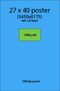 |
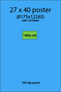 |
Until all cameras are 5K resolution and one can easily shoot their whole film this way, part of the collateral damage from the transition to digital is that this is yet one more thing that a filmmaker has to think about…in the days of 35mm, it was common practice to pick a frame of the film and scan it into a large still for use in a poster, but if the maximum output or effective maximum output from your camera is 1080p, you don’t have that luxury.
The end result will produce a blurry image at best and a pixelated image at worst. While this might be good for a background image, if you would like to use a close-up of someone’s face or a full body shot, this is just not going to look good.
Now that we’ve agreed that we need still photographs, what steps can you take to ensure that you will get something that you can use, both in terms of quality and content?
How to make sure you have images for key art—no matter what your budget
You are shooting with a great camera that can take great stills. But what if you can’t spare the time to use the camera you’re shooting on to also do stills?
On to Plan B. Hire a professional photographer, or at least someone with a really nice camera. In an ideal situation, you would get another 5D to take stills to complement the main motion picture camera. (Per my DP friend…Snug up to the lens…use Zeiss prime lenses for sharness or Canon L series lenses if going for more of a softer thing. If you can’t do that with your budget, use a monopod and critically check focus). This is great advice. If you have the budget for it.
But creating images for a poster is more than just producing nice photos. Shadowing the film shoot with a still camera often produces shots that are great for press stills, but may not be all that useful for a poster. Of course it depends on what kind of poster you will want to make. But in the end, it’s good to have a Plan C, and not in the sense that you need a third option because the first two didn’t work. I mean a concurrent Plan C.
This is it: Think of shots for key art as publicity shots, not as enlarged film stills. (And by “publicity shots,” I don’t mean for the actors, I mean publicity shots for the characters, so make sure they stay in character while you shoot them.) It’s fine to do what my DP friend says, but you need to do more. There’s lots of down time on a shoot. Actors are present and in costume and makeup. Move away from the action of the film. Use that hired photographer. Or use hire an intern with a good eye. Use that second 5K camera. Or get an inexpensive 16 megapixel camera. It doesn’t really matter. Just do it. Start outside around lunchtime, when the light is best. Find a white wall, or hang up a sheet outside somewhere. Think about what kind of poster you’d want to make. Develop half a dozen concepts (more on this in parts 2 & 3). Take it seriously. Start shooting.
What you should be creating here is this: Hi-res Scraps. You don’t know how you will use them, but at least you will have something.
Don’t have the budget for a second 5K camera? Fine. But we’ve gotten to a point where consumer cameras can actually produce extremely high quality and high resolution images. Last year, I bought this point-and-shoot camera on Amazon. It’s 16.1 megapixels. It lists right now at $150, but I think I bought it for $109 at one of those after Christmas sales. Every filmmaker has the budget for this much. You’ll be paying a lot more to correct this down the road if you feel this will put your budget over the edge.
See how much more you can get in terms of resolution when using a 16 megapixel camera as compared to a frame grab?
Is this a crappy camera? Compared to the ones you are using to film your shoot, absolutely. But graphic designers have their bag of tricks. Perhaps you’ve heard of Photoshop? We can make even images from these cameras look great. If the right shots are taken. So now there is no excuse to come back from a film shoot empty handed in terms of images for your key art… It is like buying key art insurance: you may not need to use it, but in a pinch you’ll be glad you have it.
Next week, in Part Two, I’ll give you some examples of a few concepts every film should have their “key art still person” shoot.
David Averbach December 12th, 2012
Tags: film marketing, film shoots, images, independent film, key art, One Sheets, Photograhers, posters, resolution, stills
Tips on producing Creative for your film
by David Averbach, Creative Director, The Film Collaborative
In the past two and a half years, The Film Collaborative has worked closely with hundreds of films. When it comes to Creative, such as key art, trailers, web sites, press kits and stills, we see a lot of small and not-so-small mistakes. As Creative Director of TFC, it’s my job to flag anything that could pose a problem, whether it’s on the film festival circuit, being presented to film buyers, or being prepared for digital distribution. In the coming months, I’m going to try and tackle many of these items one by one in depth. The first blog, if it indeed will fit in just one post, will focus on the technical, aesthetic and practical concerns involved with creating key art. In the meantime, I offer some teaser “tips”:
Trailers.
If your film is having a theatrical release, or even if it’s not, chances are that you will want it to be on iTunes one day, either in the iTunes store for sale/rent, or on iTunes Movie Trailers before your theatrical. Apple is very strict with their trailer specs: you’ll need to produce either a 1080p or 720p .mov file that is either uncompressed or outputted in ProRes HQ. They will not accept up-res’d or otherly compressed trailers. So make sure you leave room in your budget to produce such a file, because you may need your lab to do it for you. The good news is that a 2 minute trailer will generally fit on a data DVD, or a USB thumb drive, so you won’t need to buy a special hard drive to submit.
But there is one more catch: the trailer needs to basically be PG, or approved for appropriate audiences. Remember, trailers are not behind Apple’s pay wall. Apple will reject trailers that have expletives (even in subtitles) and nudity of any sort (including sex toys), and could reject a trailer for the same things that the might cause the MPAA to give the trailer anything but a green band if it were ever to be submitted for a rating, such as underage drinking, pot smoking, excessive violence, etc. So while cursing and nudity will definitely be rejected, for those of you who point to other trailers on iTunes with someone snorting cocaine in them, I would respond to you this way: why risk it? Are these things so essential to your trailer that you would want to have to pay your lab or editor to redo it, while at the same time postponing getting your trailer up? Remember, the majority of Apple’s trailers come pre-rated by the MPAA, who is known for being wildly inconsistent when it comes to their rating rationales. I have no reason to believe Apple is any different, and we know so little about their process that it doesn’t make sense to take chances. So if you want to create a racy trailer, that’s fine. Just also remember to create a squeaky clean version as well.
Press Kits.
Do you NEED a “designed” press kit? You know, the kind that has edge-to-edge bleed? The short answer: probably not, unless your film gets into a top-tier festival in Europe with a film market, such as Belinale/EFM or Cannes/Marché du film. Because if you don’t, it will be like showing up in a tweed jacket to a black tie wedding. Those Europeans have really nice press kits, with all of their fund and film foundation logos, so it’s best to play the game. And I believe that Berlinale asks for a certain number of printed copies to be sent to them in advance, and Cannes makes their press kits available for download right from the film detail page, so make sure you keep this in mind. Otherwise, there’s really no reason why your press kit can’t be a PDF of a Word document.
But that doesn’t mean it has to be boring. Why not use the same or similar fonts to the ones in your key art (you can even ask your designer to give you the fonts or your title treatment for this purpose) and create a really good-looking press kit yourself. But if you’re doing it in Word, don’t despair too much about how it looks when it is printed out. Very few people will do this, so don’t import hi-res photos into Word…it will only weigh your final document down. Use web-res photos (72 dpi sized down to no larger than 7.5″ wide) so that they can fit in your document and your file size can still remain relatively low. The last thing you want is a 12MB press kit…it’s just bad form. Keep it under 2MB, but absolutely no more than 4MB. Also keeping it in Word allows you to update it more regularly with new quotes or laurels. If you need samples, there are many examples of good-looking press kits on the TFC site.
Press Stills.
The stills you include in your press kit do not have to be the same set as the ones you make available to the Press and to film festivals? Why? Because in your press kit, they will be viewed as a group. In a review article or in a film festival catalog, there will be no more than a handful, and more often than not, they will only choose one, and you won’t get to choose which. Regrettably, many filmmakers send us photos to put up that are just plain dull; that have unreasonable copyright restrictions; or that are lo-res or poor quality. So, what questions should you be asking yourself when accessing photos? Here are a few: Does this photo represent the film well enough if that’s the only photo used? Will this photo make anyone want to see my film? Is this photo compelling? Engaging? Do you have a famous or recognizable star in your film? How will that photo look when placed next to six others in a festival catalog? Am I thinking about marketing when I chose this photo or am I thinking about art? If this were the only photo shown, does it make sense in conjunction with the synopsis I’m providing about my film?
Another recommendation: Embargo the main still you choose for your key art. Otherwise, your campaign can look unnecessarily narrow. If you look at the film carousel on TFC’s home page, you’ll see that each film has a different image as the main image in the carousel than from the image used most prominently in the poster.
And if you are using 1080p stills, which are only 1980 pixels wide (about 6.5 inches at 300dpi) do not crop your images, as festivals may need to use every inch to fit the design spec of their catalogs. Many festivals like having 16:9 images.
And for Pete’s sake, do not be stingy with your press stills. Make them available. Easily. Don’t require passwords or permission or complicated ways to download. You don’t have to offer every still this way, but you should have 5-10 that can go out into the world without complications.
Key Art.
Design your posters to be 2:3. Not the proportions of 8.5×11, or 11×17, or something else. This will give you the greatest flexibility as you move forward with marketing.
So, if we’re talking web-res, like for IMDB of if you’re submitting for VOD, 1200×1800 is a great size to give them, although Apple requires 1666×2500. They don’t display the art this big, but they appreciate being sent these sizes, not tiny thumbnails.
But even before you are submitting, have your designer output samples in a variety of sizes, like 600×900, 300×450, 200×300 and 150×225 (all multiples of 2:3), or resize them yourself in Photoshop or Apple’s Preview app. Why? Because you need to access your art and see how it’s going to look in a variety of sizes. What will it look like when it appears in the iTunes store or Netflix or Flixter next to an array of other titles? What happens when you see it a little bigger, like on a detail page? Can you make out the title and the main image? This is probably the most important question you need to ask regarding the value of your key art, and you need to do it in the size it will be when it’s finished.
How about printed one-sheets? Printed posters in the U.S. are either 27×39 or 27×40. It’s close to 2:3 but not exactly. And you may need up to a .25” bleed on all sides. So tell your designers to design to 27.5 x 41.25. That is 2:3, so you can then take your huge poster file and resize it down to your webres sizes. Make sure to leave plenty of room on all sides, so you’ll be able to crop it to the size your printer can print, and also you won’t run into the risk of having the edges of your poster blocked by a marquee and making your poster feel unnecessarily cramped.
Website.
Do you need a website? Yes. Will people think less of your film if you throw up a generic-looking WordPress site? Yes. Stay away from flash sites…they are pretty but costlier and harder to maintain and not viewable on many, many mobile devices. The best sites integrate Facebook, have a trailer, provide a list of where the film is screening, and have a place where film festivals/industry can go to get what they need. This is the minimum. I believe that it’s better for your site to inspire confidence by good aesthetics and do less than for your site to do everything under the sun and look like heck. Because there’s always your Facebook fan page as well. I’m certain that our Director of Social Network Marketing has a lot to say on this subject, so maybe in the future, you’ll see a joint blog post where the two of us can hash out the relationship between website form and function.
I hope these tips were helpful. And TFC members, keep in mind that if you need advice about any of your creative, you can request that some of the hours you receive for distribution analysis with your TFC membership go toward advice about your Creative.
David Averbach August 1st, 2012